Tuesday, August 25, 2009

APRIL - Monster Mashup

Yet another retroactive post!

This was a fun one indeed. I am always pleased to work with the my friends at Fundex Games. I recently attended their annual picnic (a luau theme) and was filled with gratitude for the relationship I enjoy with the company and its people.

A while ago I got an email about some character designs for a game called Monster Mashup. The cool thing about this game for me is that I had redesigned it once already about 8 years ago; when it was called I've Created A Monster. I did this time what I did before: took the existing game and, with direction from the art director, tried to give it a new personality. When I got the old game for reference I opened it and saw spread before me a small collection of my VERY FIRST vector characters. I remember my enthusiasm when I did them...which was nothing compared to the horror of seeing them years later. It was humbling to say the least. Sooooo, in order to be proud of them in another 8 years I wanted to give it a solid effort.

I went to town on some sketches. I was limited the first time to giving all the characters two arms and two legs. This time, that was not the case although most of my multi-armed monsters looked a little too monstrous. I just drew for a while and weeded out the ones I didn't like. We (myself and the project's designer) revised those a few times, switched a couple out, then I went to color. Eventually, I came up with some drawings I am now very proud of. The process was refreshing and challenging. It was nice to do some really goofy stuff.

Here are a few gems from this rewarding exercise in character design. Once again, not all of the art is here. If you wish to see everything (monsters, scientist and package art) you must get the game...and play it.

These guys made the cut and were eventually 'vectorized'...


These are some rejected concepts...


Wednesday, July 22, 2009

March - Asher Roth album art

This is old news now, but at the time I was up to my ears in work and not really itchy to talk about it right then. I was once again called on by my friends at HDU Creative to collaborate not only with their designer Damon, but also my good friend Ben Long. The three of us went to Herron School of Art & Design together and have been friends for several years; it's cool to work with people you know and respect.

I submitted concepts for every face of the 10-page fold CD jacket as well as art for the inside and back of the CD case. After many rounds of conceptual revisions, I ultimately handed over some clean and stylish illustrations. The imagery was geared specifically to support the themes Asher Roth has established in his music to this point: good times, intelligent rhymes and of course, many rows of white bread.

A lot of fun, a lot of work. All sketches were done in pencil then scanned in for any changes or modifications. All final art done in Illustrator. NONE of the art posted here is final. If you want to see the completed designs, you will have to see the disc itself. Seriously, it's impossible to find all the jacket art online.

2 sketches for inside art


And some of the vector work...


This was a great gig. I hope to do more work with artists in the future.

Saturday, February 28, 2009

Pickle Punks A Puny Pod

OK, I'm cheating here by posting something old but at least it's something no one has seen! I ran across this as I was collecting samples of my character work from my machine for a piece I'm working on now.

These little dudes are characters I drew up for some hand made jelly labels. For the last few years, my girlfriend and I have made jellies and jams as Christmas gifts for family and friends. Each year we have introduced new recipes for which I will make a new label in the style of 'fruit with humanoid face and tiny cartoon limbs'. This was my second design for our pickled green beans. I was told by my jelly partner that the first was too mean-looking and that was true. This is one of many in my collection.

Tuesday, February 17, 2009

Asher Roth mixtape: The Greenhouse Effect

I worked with Heightened Designs Unlimited (HDU Creative) on this project. I did a lot of research for this one as to the likeness of the subjects and their respective bodies of work. These DJ's have a steep reputation as you will find if you look. Asher Roth, on the other hand has really surfaced in the last 2 years and is all he is cracked up to be when it comes to rapping. He also has a social community, a myspace page (both of which are beautifully designed my HDU Creative), and a growing list of TV appearances and articles, both in print and online. Basically, the collaboration of these 3 is a big deal and has created much buzz which you will notice if you haven't already.

The name and uh...theme..of this mixtape cover were already in place when I got the call. I submitted 3 concepts in the style of 'mad' scientists, this one not the most mad, but certainly the best portrayal of Don Cannon, DJ Drama and Asher Roth.


Asher Roth can really rap. Check it out (Explicit), download it for free...HERE

Thanks to Heightened Designs Unlimited and everyone on the Asher Roth team. This was a real joy for me.

Thursday, January 15, 2009

Jelly Bean Jumble

While at Fundex Games, I worked on their line of Lunch Box Games. I did illustrations for the boxes as well as components for Cookin Cookies, The Storybook Game and Wormy Apples. Although I left the company a few years ago, they thought of me when they expanded that line with another game called Jelly Bean Jumble. It was great getting back into that way of working after a long break from children's art. Below are sketches and final art for the box illustration as well as the Jelly Bean cards themselves...

6 Rough Concepts (composition predetermined to adhere to brand standards)...........................

1 Final Pencil Sketch - 2nd of 2 revisions (combination of favored elements of the roughs)...........

1 Color Sketch (with layers so the designer could adjust)........................

1 Final Illustration (this is the art I sent that was adapted later to the approved package design)...

And the Beans:

4 Groups of 6 concept beans (4 options)

6 Final Beans (to be printed on cards and die-cut).............

As usual, simple won and won big in this project. Good fun and always an honor to be the guy for the job.

Monday, December 1, 2008

Cover illustration for incredible metal band Ghost Of Maine

Ghost Of Maine were voted the best unsigned band on Myspace in 2008. They're locals and they asked me to draw a man being ripped in half by a werewolf for the cover of a forthcoming album. I did so with little hesitation.

Check them out on Myspace and hurt so good.

Thursday, October 23, 2008

When It Rains, It Pours

HotBox Pizza Headquarters
I have enjoyed a great relationship with HotBox since I designed their logo in 2006 and painted the first of their stores, now three and counting. The latest project was to bring some of their store flavor into their offices. I am grateful to be called upon time and time again by a client that I truly like and respect. We established the 'street art' style characters and the burning background for their look in the beginning to stand apart from other pizzerias and appeal to their young customer base.

Other
In general, I have been busy. There are other projects but I'll keep it brief. But, I am quite pleased to present the latest character work I've been doing. A friend asked me to help out with T shirt design he's doing. Once he told me what he was looking for, I had to do it. This is a ferocious werewolf. Neither are final.
There is plenty more in the ways of music and painting but everything in moderation. It's busy, very busy. Too busy, in fact, sometimes. All good though, better to be tired than bored.


Tuesday, August 19, 2008

Lego Me Ego!


Sometimes, you just find meaning in the strangest places.

Tuesday, May 20, 2008

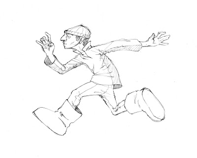
Officer, that man stole my boots!

Well, they must be stolen because they obviously do not fit this man. This is the result of yet another meeting. Although they are necessary to further some aspects of a project, I relish meetings for the drawing time they often yield. Since most of my meetings at work are of an administrative nature rather than a creative nature, I usually bring some paper and pens. I do take notes of course, but occasionally I will draw something memorable.

This dude is a good example of some of the things I like to draw as well as things I like about the work of others. I have always liked running poses because of the implied action. When a person is running in a situation that matters, they act with abandon. The movements are too fast and powerful to be graceful. Such is the case with this fellow; he is more or less stretching every limb in order to fling himself further.

Another thing I like about this sketch is all the drapery. I never understood as a youngster why so many classical paintings featured excessively robed figures. Over the last several years it has become one of the most enjoyable things about interpreting life in drawings. The way fabric shows the shape of the object supporting it is very elegant. Even the most geometric object becomes fluid and organic when adorned with drapery. Although the underlying structure is obvious, a draped surface is faceted and ever-turning.

This sketch also hearkens back to my days as a Jim Lee fanatic. His work on the uncanny X-Men and later X titles featured some cool costume designs. I give a subconscious nod to his work with this basic 2 tone shirt.

Lastly, I think the face of this man is a direct influence from the work of Chris Sickles of Red Nose Studio. His characters always have a very aerodynamic quality, particularly in the way the nose protrudes from the face. Again, not intentional, but I think I took this guy's profile directly from the Red Nose work I have seen.

Monday, May 5, 2008

Okay, A Skull Warrior

My love affair with fantasy art is once again in full swing...maybe it's just the spring air. At any rate, I have reached the culmination of my impromptu series of skull-related drawings and paintings with this, my Skull Warrior. I have drawn skull masks for years but never gave one a body. I did this sketch because my friend Joseph Cross (Cross's Studio) asked me to draw a character that he could model in 3D. After a few attempts, this guy above was what I eventually came up with. I drew this much by hand, then scanned it and finished it in Photoshop.

This is what it looks like now:


And, of course, if it is to be modeled then I have to also provide 3 views. I did the views in Illustrator; I prefer to do anything that must look clean in AI. Plus, with views it's great because I use smart guides at all times so it's easy to turn a figure and adapt it's features to the same height or position from many angles. I had also hoped that Joseph could import the vector curves and work from them as a basis. I don't think I have figured that out yet, but man if ever do!!!!

Friday, May 2, 2008

Fictional Transport


As a welcome change from skulls and fire, I have slipped back into fantasy mode. I have always enjoyed imagining the way things work. I think it started with all the helicopters in the 'army' of military thrillers that proceeded through my childhood (Rambo, Commando, American Ninja, Predator...and a bunch of other terrible classics that feature situations which require a chopper). The thing that intrigued me about a chopper is that many of its mechanics are exposed; not hidden like with most of our cars and other conveniences. My limited knowledge of geometry and physics were enough to rekindle this fascination in high school and it has stayed with me in some capacity ever since.

Monday, April 7, 2008

Roots

March was a scarce month for blogging with little action going on in the studio. I participated in the Pivot Gallery farewell show which was an honor. The Pivot Gallery has presented SubSurface the last two years for which I could not be more grateful. The farewell show was an exceptional privilege because I had the pleasure of hanging alongside my favorite local painter, Brian Myers and well known illustrator, Chris Sickles of Red Nose Studios. Both are people I have looked up to for some time. As I have said before on this blog; it's an honor to be invited to join such company.

Another very important thing I did last month was to document some of my favorite sketchbook drawings. It was so exciting! It's no revelation that I revel in the life of a sketch. It's where all the stuff really starts to happen. I learned long ago that everything beyond a sketch is labor; Labor I can live with, but nonetheless a finished piece is not the reason I draw. So, here again are some of my favorite sketches.


The above drawings are just plain silly for the most part. The top is the result of a 'humanoid' phase I experienced and is, obviously, a different perspective on pet ownership. The second appears to be a commentary on drug abuse although I had no particular reason to address the subject at the time.


This last one is one of my most faves because of its relative completeness. It really looks like a book cover waiting to happen. Maybe because I had been reading more fantasy at the time. Either way, there is a narrative here. He seems to be a spy-ish fellow seeking cover behind a poorly endowed tree (whose species is otherworldly) and ready to toss a futuristic explosive device. Balanced and rendered, it almost appears that I had a plan for this one...One day.

Thursday, March 13, 2008

A Painterly Line In The Sand

The following is more of an essay than anything else. There is no image for this post, only words.

I just got off the phone with a friend of mine who is also an artist. He is actually finishing his BFA right now at the school I attended. I had called to ask him a question about a show we're both in soon and he told me that he had just seen a slide of one of my pieces in his practical concerns class. This is a capstone course that is intended to acquaint the student artist with the professional word of Fine Art. Although I found it funny and kind of nice, I never thought to ask him why the professor had shown it.

I later called him to ask why my piece was shown. His answer soon became irrelevant as he elaborated on his own thoughts about the piece. Being that this was a piece I did a few years ago, it was done in a style that has since evolved into a pretty different look. He said he liked the drawing because it was more of a drawing and less like an illustration. I laughed to myself and asked him "What do you mean 'less of an illustration'?"

"In school they teach you that the head is round and there is a shadow under the bottom lip...an illustrator seems to just use that and generalize the figure. It's like they draw every ear the same instead of looking at each ear and (interpreting them differently). It's just interesting how all illustrators seems to be out to suit a really wide audience and fine artists like me could care less...what the manager at Kroger thinks." My only defense is that I have yet to be hired by Kroger or any of its employees. And I bet that if the manager at Kroger offered to by one of his pieces, he would care just a little bit about what that person thinks.

This conversation reminded me that the illustrator (which I now know definitely means me) is discriminated against by the fine artist. Despite what even my closest friends tell me about my work, we will never be equal to some. In school, it was very obvious that illustration and graphic design in general were seen as lower forms of expression. I even felt this way at first. I struggled a lot with the fact that I had no idea what my work should be about. This was a crippling conundrum because it led me to make no personal art. I did school projects and always had the mural stuff going on but I never really had a clear vision of myself as an artist. It was very frustrating because I developed a lack of respect for commercial artists but at least they knew what to draw and were getting paid for it.

One day I was with a friend in his apartment and I told him exactly that: I have no idea what my art should be about. He was studying graphic design at the time and said "That's because you're an illustrator dude." I was a little shocked that he would know that because I had not considered a career in illustration since the fifth grade (when I also wanted a pet cheetah). After some research I realized there was a world of opportunities for people like me who get a kick out of showing others what their thoughts look like. I had done it my whole life just for fun. In the fourth grade I hung an envelope on my desk marked 'drawing requests' and took all comers.

Now, as a career commercial artist, I have a different opinion about art. My professional work is what led me to an understanding of the artist I am. I eventually learned that I do have a perspective and a voice. But, I have also learned that there is a legitimate tragedy in making images I would never dream of doing without the promise of money. I still think that the truest form of expression has no dollar amount attached. Also, to a degree, what I do during the day is not art because its intent is not artful in nature. I generally have to meet the demands of a client that has never met me, has no concern for my creative relevance and little or no knowledge or appreciation of art at all. That last part is the hardest pill to swallow but it does not change the fact that I am filling a creative need.

In a world where we are literally faced with ads and propaganda all day long, it's nice to know that i can make less of it suck to look at.

As an in-house artist, it's not about what I want or believe (although I rely heavily on what I know and think to get the job done). Most of the time, I make work that has little personal significance and I usually forget about most of it because I tend to move quickly. I think fine art is about challenging ideals and always exploring but that's not what pays my bills at this point. I am not offended when people don't understand my personal art or even if they don't like it; I have dealt with that from the start. I don't expect people to get it or even care about the stuff I do in my free time. During the day, though, I have to care what others think because it's not my opinion that matters most. Someone with a real creative need depends on me directly or indirectly to know what to do when the time comes.

By comparison, Fine Art prides itself on not having to please anyone in order to be justified. While that is a great reason to be an artist, there do not seem to be any artists buying my work or hiring me for anything. Although I care very much what they think, pleasing other artists has not been nearly as profitable as pleasing those who simply need some kind of art. If that sounds like selling out, well it kind of is. But art school only gives you a degree in a hobby, it's up to you to make it a career and this has worked for me so far.

I have been invited by other artists to hang art in group shows. This is the highest honor I have received as an artist. There is no promise of money or future work, but it's proof that I am respected by my peers. It's proof that I exist in the community and that I have my own ideas. That's what we're all looking for in the end: a place in the art world. It's good to make a living doing what you always wanted, but there is no shame in just having a job where you draw stuff for people. I say get in where you fit in; a lot of other people never even had a choice.

I later told my friend that we need to talk about these things more often.

Monday, February 11, 2008

Fun With Characters

Character design is a huge part of me. I did not know it at the time, but my childhood was all about character design. I loved the look of people and things and the way you can assign different attributes to a character to make it 'speak'. Sometimes my job requires me to design characters. Although this is not a service the company offers, it is sometimes involved in the work we do. Here are a few examples I did for recent animation. It has to do with heat and cold....